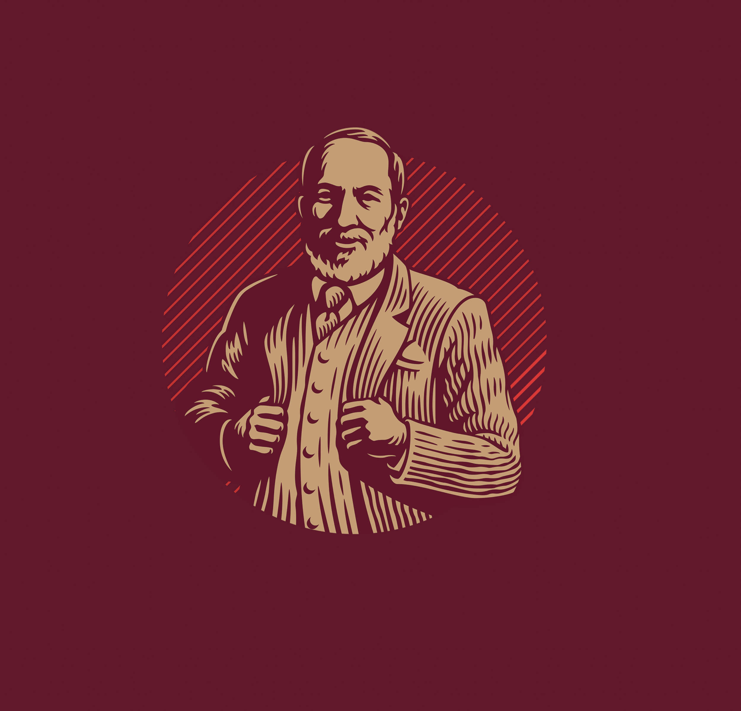
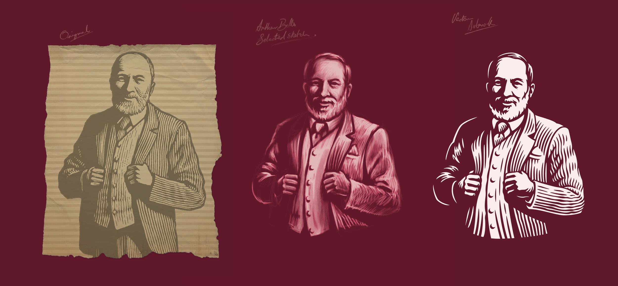
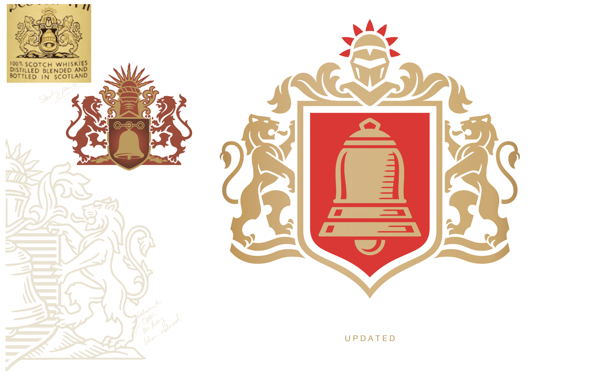

I collaborated with Bulletproof to refresh the Bell’s Whisky brand, focusing on two key elements: the family crest and the portrait of founder Arthur Bell. The aim was to preserve heritage while giving the visuals a bolder, contemporary edge.
The portrait of Arthur Bell was redrawn in a single colour, making sure to maintain his likeness while introducing a bold, contemporary woodcut finish. This helped the images legibility at smaller sizes and across various print applications.
The Bells family crest was meticulously redrawn to preserve its heraldic accuracy and historical significance. The updated version is cleaner, more versatile, and works across all contemporary branding applications.